This week I was tinkering with creating a Table Of Content for a client. But I wanted something that would be more informative than just your standard TOC, which have always seemed to be a bit of a waste to me. The client needed an overview of departments for the high-level folks, and then a drill-down to the individual departments that would also be visible to department managers. I thought if I could combine the TOC and the overview viz, I would have the proverbial two birds with one stone scenario.
While I’ve never had much use for Tree Maps, I thought this viz type might serve as a good scaffold for a TOC — at the very least I could color-encode some relevant measure. But it turns out that by using an old trick of Andy Cotgreave I was able to get all the required overview data into the TOC by putting the bar charts inside the tree map. Here’s a remake of the viz using Super Store data:
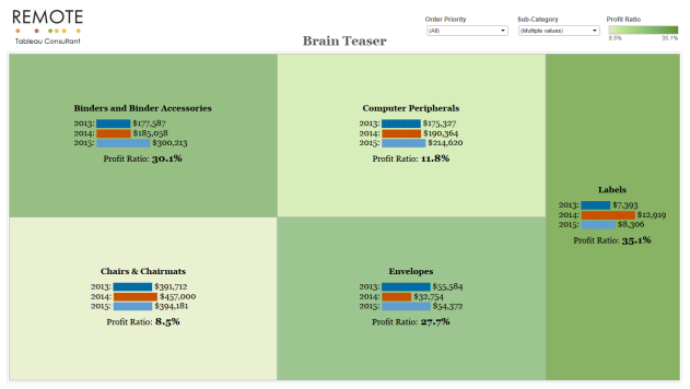
Spoiler Alert: You’ll notice the Brain Teaser title. I post this as an Educational Brain Teaser on the forums earlier this week. If you want to take the challenge, go there before reading on. The rest of this post provides step-by-step instructions on how to create this viz…
First, there are three challenges involved 1) Getting the bar charts inside the tree map 2) Getting the bars & text alignment worked out, and 3) Sizing the bars and the tree map boxes. So let’s start.
1. Open a workbook and connect to Super Store data. (Your data will probably have different dates than my example because I shifted the dates so I can answer forum questions that need the TODAY() function to be relevant.)
2. Create a calculation titled MIN 1 and put this in the calc: MIN(1).
3. Now using MIN 1 and Sub-Category create a Tree Map. While the boxes will be different shapes, they all have the same area. If they didn’t then the smaller ones would end up hiding the labels, which we don’t want.
EDIT: One thing I forgot to mention is you need to filter the Sub-Category down to 5-10 members. This technique falls apart if you have too many members. My client had ten departments on a 1500×800 dashboard and it just fit. Any more and things get wonkie.
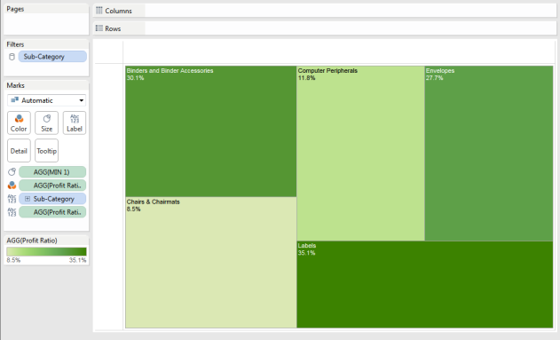
4. Now drag Profit Ratio onto the color shelf (replacing MIN 1). Also drag it onto the Label shelf. You should have something similar to this:
5. Now we need to create several calculations to use for our bars:
A. 2013: IF YEAR([Order Date])=2013 THEN [Sales] END
Repeat this for 2014 & 2015 or 2010-12 for your data.
B. Three Years: IF YEAR([Order Date])>=2013 AND YEAR([Order Date])<=2015 THEN [Sales] END
6. Now comes the Cotgreave magic. Create this calc named TT 2013 (or similar):
LEFT(“█████████████████████████████████████████████████████████████████”
,ROUND((SUM( [2013])/SUM([Three Years]))*25,0))
Note that in the original formula, which is written up in this KB article, Andy used 100 instead of 25. I had to change it to get the bars to fit in the boxes, but the ratio is the same so the bar lengths will still be relevant to each other. FYI: The black bar is made up of 100 ASCII character 166, in the Arial Unicode MS font.
Repeat this formula for the other two years.
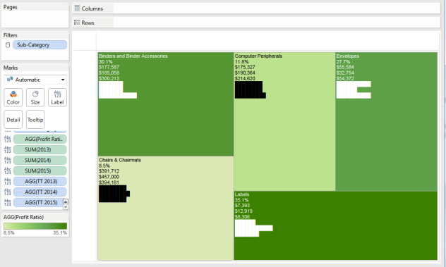
7. Drag all of three TT calcs and all three year calcs onto the label shelf. You should now have something that looks like this:
So now we’ve got the bars and all the rest of the info in the Tree Map labels. All that’s left is to format and align the labels. This next bit was a revelation for me. I hadn’t really played much with the difference between the alignment setting for the entire label and the alignment settings within the Label editor. I hadn’t realized how they interact, and allow us to get a label just right.
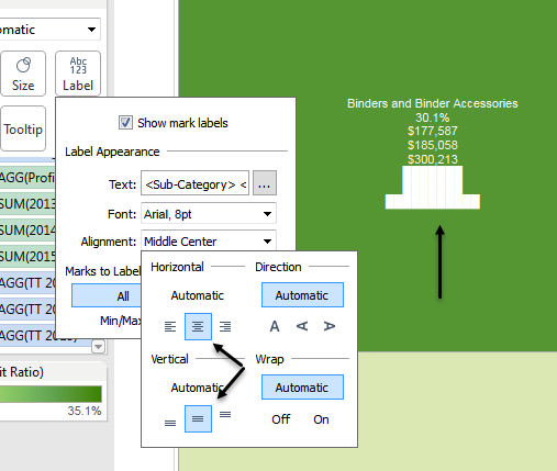
8. Click the Label shelf and change the Alignment setting from Automatic to Middle Center. It should look like this:
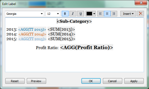
9. Next open the Label Editor, format, reorganize & color the bars so you get something like this:
Note that the Sub-Category and Profit Ratio are centered, while the bars and their labels are left justified. If we didn’t left justify the bars they wouldn’t line up at an imaginary zero line and wouldn’t really work. The other wrinkle isn’t that obvious in the screenshot, but to stop the bars from forming a block like the screenshots above, we need to set the Bar font size to something smaller than the text before and after the bars. Mine are set to 12 for the text and 10 for the bars.
That’s it, except I wanted to mention one of the advantages of using a Tree Map as a TOC is the mark is the entire box, which allows the user to click anywhere in the box to trigger a dashboard action, instead of having to click a small arrow.
Anyway, let me know if you use this technique, or have improvements on it. Happy tinkering.
Thanks a lot for this wonderful viz.Excellent!!
LikeLike
Glad you found it useful. Thanks.
LikeLike
Glad you found this useful Satich.
LikeLike